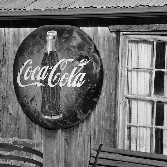
In these days of computer-generated graphics, the “art” of designing outdoor signs to promote businesses has come full circle in a few key ways. Outdoor signage began as custom hand-made signs by the local carpenter or blacksmith, went through its own industrial revolution to meet a mass-market, often cookie-cutter design demands, and then to slowly return back to a single computer artist, working with a mouse and tablet, sketching out custom sign designs.
As a local sign company who also provides custom signs nationally, Electremedia brings the individual designer back into the mix. Every one of our signs is custom-designed unique to each of our customers. While we have a couple of national accounts with repeating sign designs, 95% of every project we undertake is for a small business owner with a very unique brand. And while a logo and slogan can be nicely designed and printed onto the face of a box sign with internal LEDs to illuminated it from behind, it’s still a flat face on a black box hanging in front of your store. Why would a business owner choose such a sign to represent their brand to the outside world, and pick such a plain sign? The reasons could include:
• Having a box / cabinet sign is a condition of their lease.
This is understandable, and out of the control of the store owner (tenant). In this event, we try to design with high contrasting colors or shades, to create an added illusion of depth, and make sure the cabinet is painted and less unsightly.
• They think box signs are less expensive.
This assumption is usually always wrong in our case, but it depends on the fabrication shop. In our experience, cabinet (box) signs are more expensive than custom shaped and illuminated channel letter signs for a couple of reasons: 1. It requires far less material to make a cut-out form than it does to make a reinforced box consisting of large sections of metal, 2. It also requires less translucent plastic for the faces, if it’s face illuminated, verses printing on one very large piece of material.
Getting these savings for yourself, however, requires you to consider one question: Does the sign company have a real graphic artist on staff, or a good one they outsource to? Think about it. Would you rather have an advertising agency, with their artists, creative directors, marketing experts and media department, designing your outdoor signage, or the guy at the sign shop chugging out design after design just to keep up with sales and production? Where are the experts that you need? You may not have an advertising agency on retainer, and you may even have assurances from your sign shop that “their guy is good,” but are you really satisfied with that? Is that enough to secure your investment into their creative hands to bring the exterior branding of your business to life with the quality-designed custom outdoor signs your investment deserves?
We ask you to take a look at our Sign Posts blog, and see the case studies of before-and-after designs and installed signs. We are 3D artists and designers first, then carefully model and construct your sign from your logo specifications, and supply you with highly realistic renders that show you precisely how the outdoor sign we proposing to make is going to look. Our creative process is designed in such a way that the 2-dimensional graphics and 3D renderings we provide are the same exact same data files that are sent to fabrication, and/or to engineering and installation experts, if necessary. This process ensures that everyone – us, our client, fabrication, shipping/installation – are all on the same page. This allows for creative, unique and intricate architectural signage to be made for each of our customers. Signage that is high-quality, hand-made, more sustainable and environmentally friendly, and far more cost effective than most of our competitors.
Yes, we are a sign company, for all practical purposes. But a more accurate description is that of a design firm, that specializes in making affordable, high-quality signs.


